Mixing Prints


For Spring 2014, the black and white trend is bold and never boring. Not only can you incorporate your wardrobe basics, but you can build off them by adding prints and colours as the season progresses. Here are three different ways to wear this trend this spring:

Image

1. Go from Head to Toe

Wearing black and white from head to toe looks sharp. If you want a monochromatic look, differentiate between garments by playing with textures. Or, add one piece in the contrasting colour to create some visual interest.

Image

2. Add a Pop of Colour 

Whether it’s your shoes or your cardi, adding a brightly hued item will change the whole look. Not only will your outfit highlight the bright colour, but it makes the black and white combo more defined.
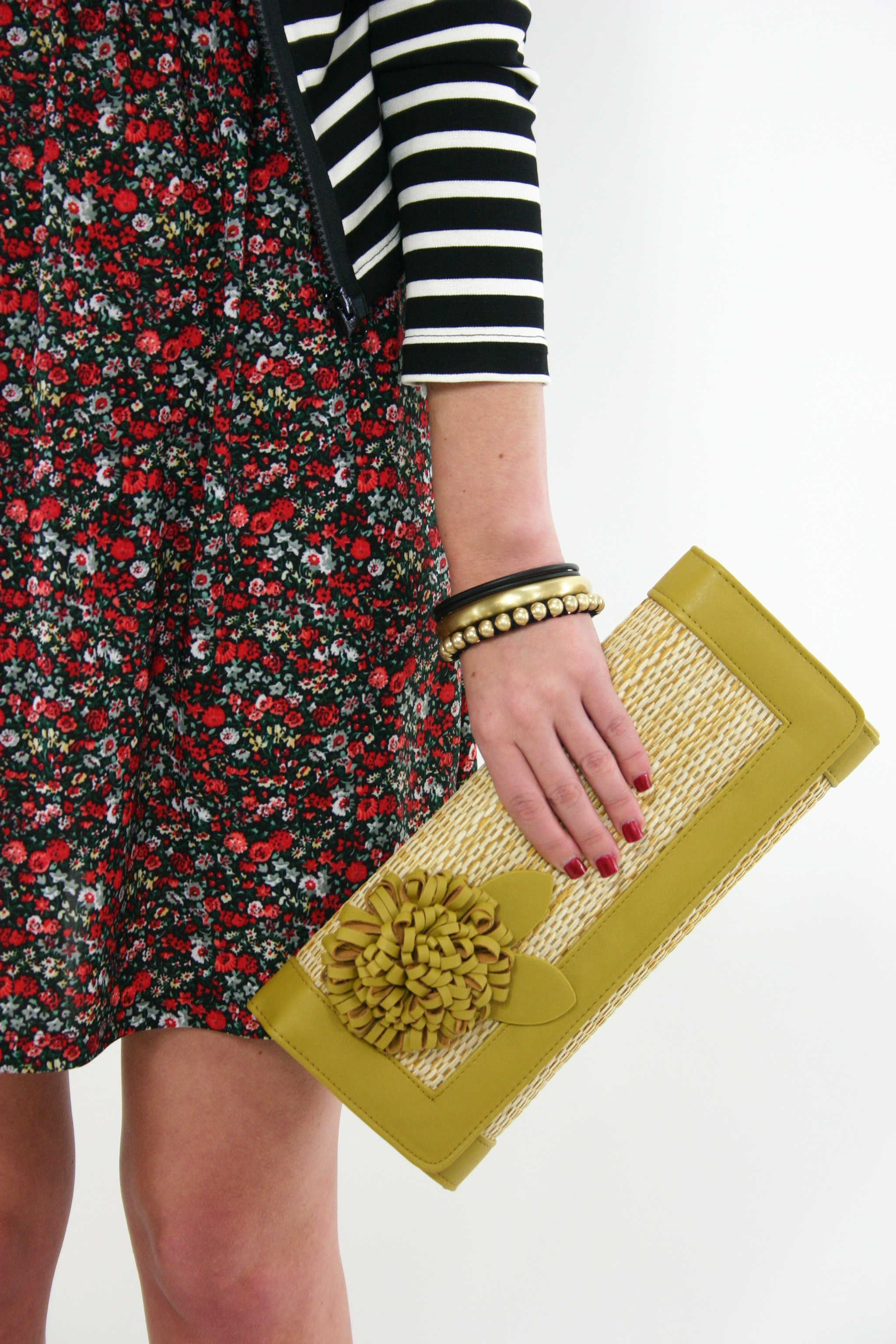
Image

3. Play with Prints 

This season, stripes and polka dots can be mixed and matched for a playful look full of personality. Whatever your comfort level, playing with prints is easy when mixing patterns in black and white.


We got lots of black and white styles in stores for spring.  How do you plan on wearing this trend?

Image

   ... read the full post and reader comments

 
lindsay's picture

Mixing Prints

ImageMixing prints is a playful way to add personality and style to your wardrobe. The art in not looking like a walking optical illusion is in considering a few easy guidelines:

Even if oversized is in this season, you still want to look like you are well put together. Fit is the important guideline in dressing well and this is no exception. Frumpy, ill-fitting garments will only make you look like the only reason you are jumping on this trend is because you are out of laundry soap.  

Mixing prints of differing scales is an easy way to begin styling your prints. For instance, thinly striped knit top, layered under a cozy thick striped cardigan is approachable. Considering the scales of some prints, such as a houndstooth, you can really consider these to be a solid, so you can be more brazen with your other print.

Colour is also key in mixing patterns.  Having your prints in a similar colour range will allow them blend together enough while still maintaining visual interest.  Or, by pairing a neutral pattern with a brightly coloured pattern, the prints won’t compete for the eye’s attention so they will work together in a way that’s easy on the eyes.

Once you have these three guidelines in mind, consider the nature of the pattern and find your own combo through trial and error. Florals and stripes are classic examples if you are in a French mood (C’est tres chique! ) While stripes of varying sizes and scales are a beginner mixer’s dream and very nautical in Spring. Mix ikat prints with stripes, plaids with leopard, in small or large doses. The real trick is to be confident and have fun!  ... read the full post and reader comments

 
lindsay's picture
Syndicate content